
Data Analysis: Strange Loop 2023 Videos
What is this?
A few days ago, I saw the videos for the 2023 Strange Loop conference starting to land in my YouTube feed.
This started out as a relatively simple question:
which videos should I watch?
It wasn’t my first time looking at a list of videos on YouTube and wondering how to find “the best ones”.
The rest of this post is the journey; trying to find an answer. I wrote this for a few reasons:
- to show how I did it – which might contain interesting techniques (ymmv)
- to show how messy this is – I think it’s normal and it’s useful to show
- to invite feedback – do you have a better way to do this?
Problem Statement
which videos are worth watching?
Of course, this is highly subjective. In my case, I’ll break it down as:
- which videos are other people excited about?
- it can be felt indirectly from the buzz on twitter, hacker news, etc…
- but it seems like number of
viewsis a reasonably good proxy

(I’m not trying to pick on anyone, it’s just an example)
- the
viewsmetric follows a power law distribution, like many popular things - this is slightly complicated by when a video was published (
### days ago)
At this point, the plan usually looks like:
- let’s get some data
- let’s throw it on a graph
Getting The Data
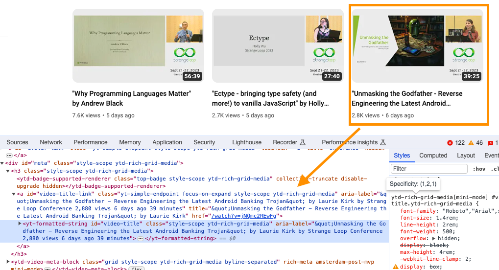
I tried not to overthink this; I decided to scrape YouTube straight from Chrome’s Developer Tools.
thoughts:
- I was surprised to find everything I want in the
aria-label - including a more precise number for
views(2,880), instead of its abbreviated version (2.8k) - this is a nice surprise, because the metadata on the playlist page isn’t as rich
¯\_(ツ)_/¯
I used this snippet in the developer console:
copy(
  [...document.querySelectorAll("yt-formatted-string#video-title")].
  map(el => el.ariaLabel).
  filter(text => text).
  join("\n")
)
breakdown:
querySelectorAllto grab relevant DOM nodes[...###]to convert to a plain array- grab only the
aria-label - filter out
nullvalues – a better selector might fix this - convert to one big newline-separated string
- use
copyto send to the clipboard
Caveat: the page is lazy-loading, scroll enough to capture all the 2023 videos
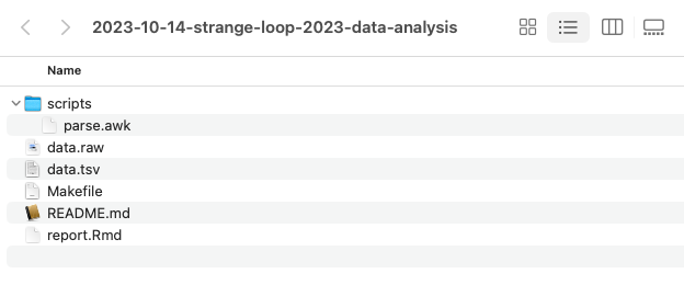
Creating a project
project is a big word. But when I manipulate data, and it involves multiple steps, I usually
create a directory to hold my files. Here’s what I did:
- I created a directory with a name that contains a date:
2023-10-14-strange-loop-2023-data-analysis - I created a
README.mdand dumped my notes in there, best effort 😬 - I added a
Makefileto document the logic- how I fetch the raw data
(although not in this instance, since I copy-pasted from Chrome) - how I transform the data
- how to generate graphs / reports
- how I fetch the raw data
- I copied a reference Rmd file
- I created a
scripts/subdirectory to hold helper scripts
The point is to do an amount of bureaucracy proportional to the task at hand.
Massaging the data
I pasted the data to a file:
$ pbpaste > data.raw
Then, I opened the file in vim and cleaned up the entries:
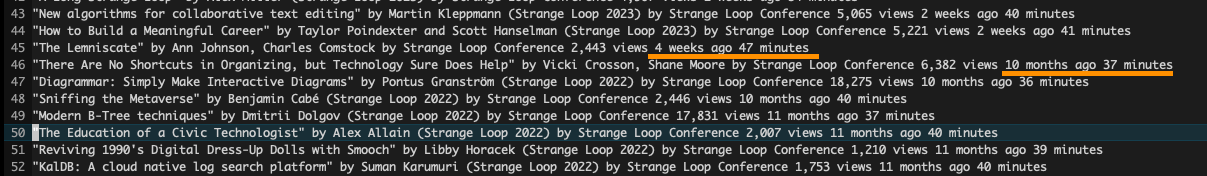
thoughts:
- the correct answer is 45; that’s how many files are in the playlist (2023-10-14)
- obvious discontinuity:
weeks agovsmonths ago - I usually automate this with a script
- to document and reproduce later
- but I was eyeballing the data and this wasn’t brain surgery
- I confirmed first and last entries, and deleted everything below line 45
Looking at the data more closely:
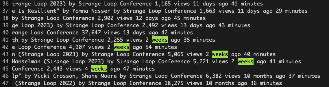
I came up with this awk script:
match($0, /(.*) (.*) views (.*) (.*) ago/, arr) {
  title = arr[1]
  views = arr[2]
  count = arr[3]
  unit  = arr[4]

  sub(",", "", views)

  multiplier = 1
  if (unit == "week" || unit == "weeks") {
    multiplier = 7
  }
  days = count * multiplier

  print views "\t" days "\t" title
}
breakdown:
- capture groups for relevant parts of each line
- title of the video
- number of views (with comma)
- number of days/weeks/months
- time unit (days/weeks/months)
- remove the comma from
number of views - multiplier: a
weekmeans 7 days- assumption: default is
days - assumption: no
monthsin current subset of data
- assumption: default is
- outputting massaged data in tab-separated format (
.tsv)- similar to
.csv - (almost) no need to worry about special characters
- trivial to generate
- easy to work with (Excel, R …)
- similar to
Again, I only did what I needed for TODAY. This was a conscious decision.
Caveats
- it’s hard to guess how data that you don’t control is going to change
- you might want to list your assumptions
- and iterate…
Here’s what the .tsv looked like:
Exploring the data
Personally, I use R. Feel free to use something else. Pick a tool and learn it well.
I loaded the data into R:
library(tidyverse)

d <- read_tsv("data.tsv", col_names=c("views", "days", "title"),
       col_types=cols(
         "views" = col_double(),
         "days" = col_double(),
         "title" = col_character()
     )) |>
     mutate(mean_daily_views = views / days)
breakdown:
- load the data
- name the columns
- cast the data to a type (not strictly necessary, but a good practice)
- add a new column as
viewsdivided perdays(the “average”)
Let’s plot views against days
ggplot(d, aes(days, views)) +
  geom_point(alpha=0.3, size=2.5, stroke=0, color="red")
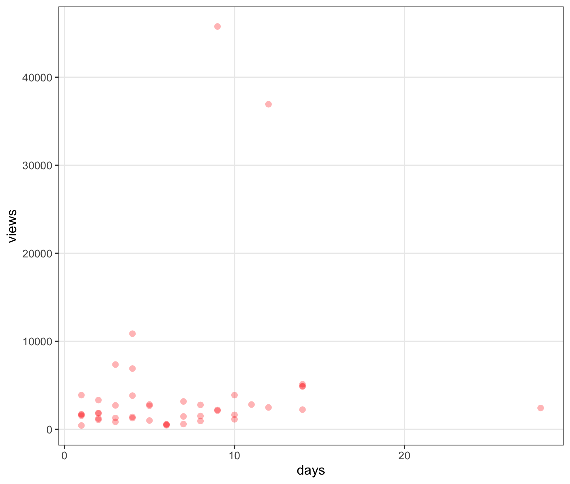
thoughts:
- more
viewsis better - but a video published longer has had more chance to gather
views- e.g. 5000 views in one day is more impressive than 5000 views in 20 days
Here’s the (power law) distribution for views:
ggplot(d, aes(reorder(str_trunc(title, 40), views), views)) +
  geom_col(alpha=0.5, fill="red") +
  xlab("title") +
  coord_flip()
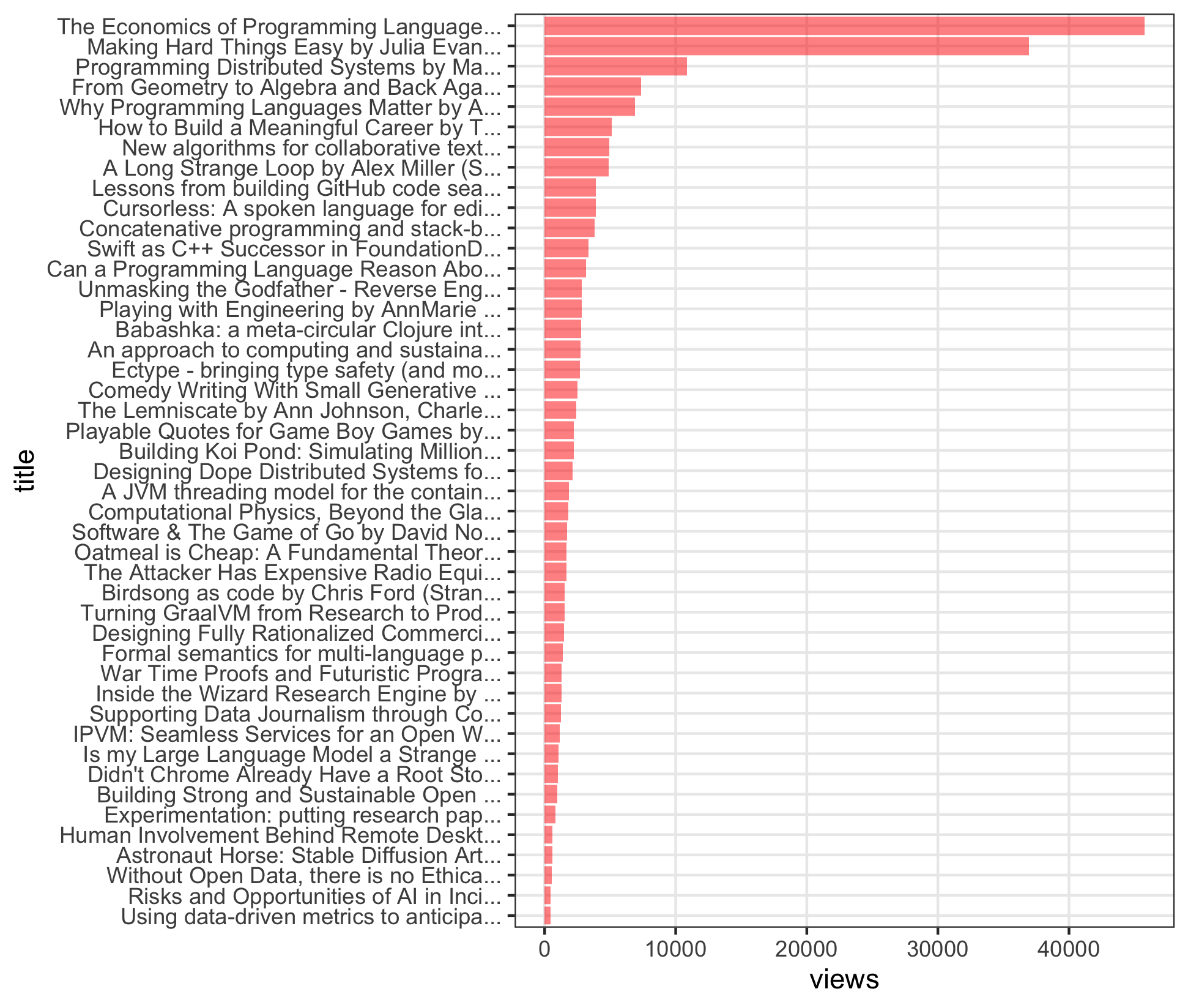
breakdown:
- a few very popular videos
- a sharp “elbow” around 4-5th entry
- a long tail of other videos
What about daily views against views?
ggplot(d, aes(views, mean_daily_views)) +
  geom_point(alpha=0.3, size=2.5, stroke=0, color="red")
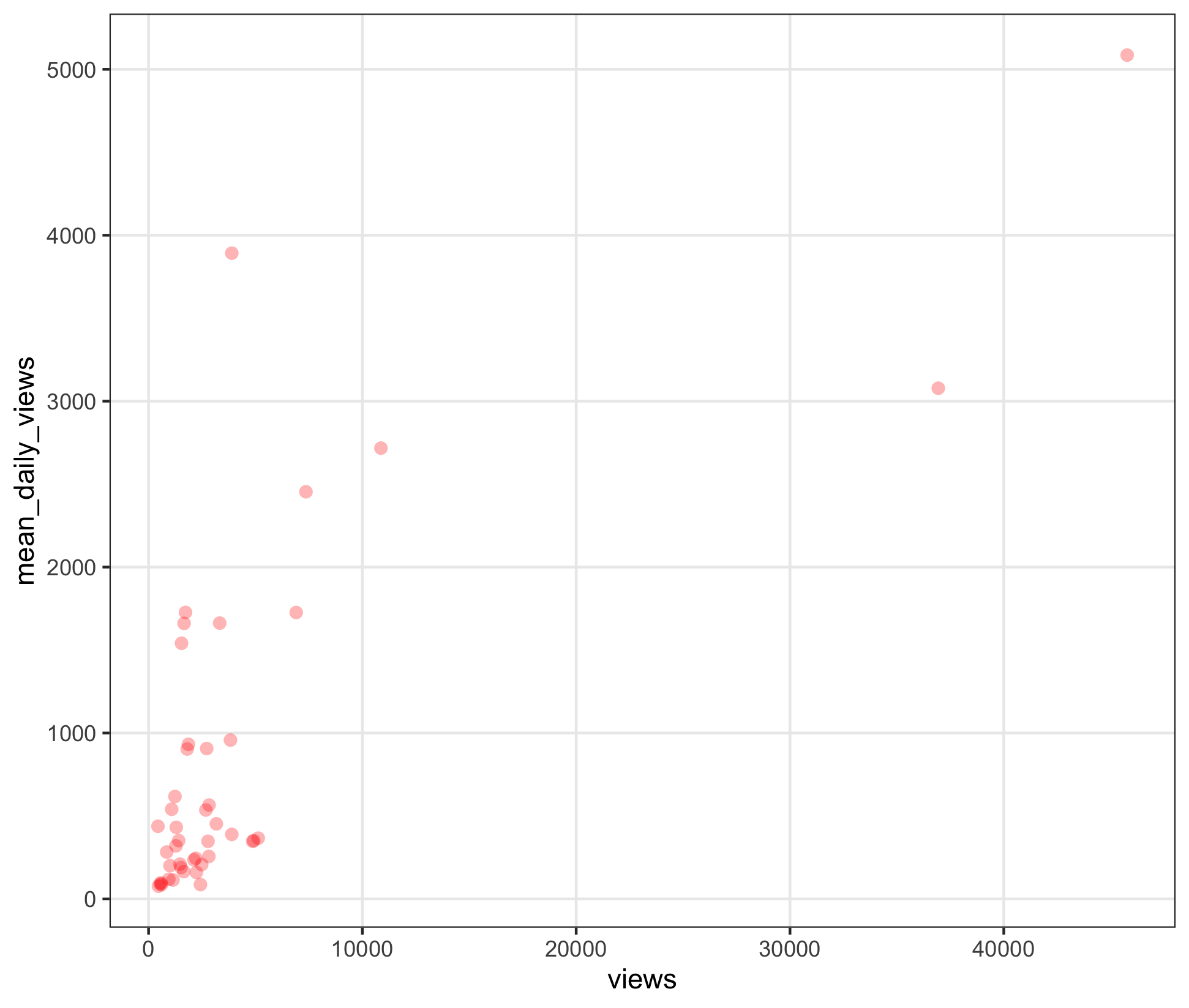
breakdown:
- more
viewsis better - more
views/daysis better - distance from the origin (in either direction) is a sign of popularity
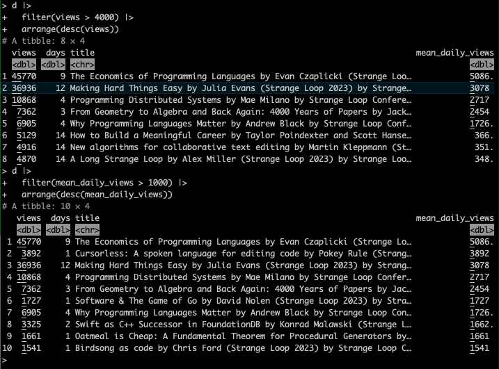
Finally, the videos, by top views and top daily views:
Discussion
In the end, I didn’t find any deep insights in this data:
- few dimensions (
viewsanddays) - unfortunately, no per-day breakdowns …
e.g. “this video had this many views on that day” - leading to averaging, which I have feelings about
Maybe the power law distribution leads to obvious conclusions: watch what everybody else watched?
Here’s another view of the same data:
d |>
  mutate(popular = mean_daily_views >= 500) |>
ggplot(aes(days, views)) +
  geom_line(aes(x=x, y=y), alpha=0.1, size=3, color="red", data=guide.data) +
  geom_point(aes(color=popular), alpha=0.3, size=2.5, stroke=0) +
  scale_y_log10() +
  scale_x_log10() +
  NULL
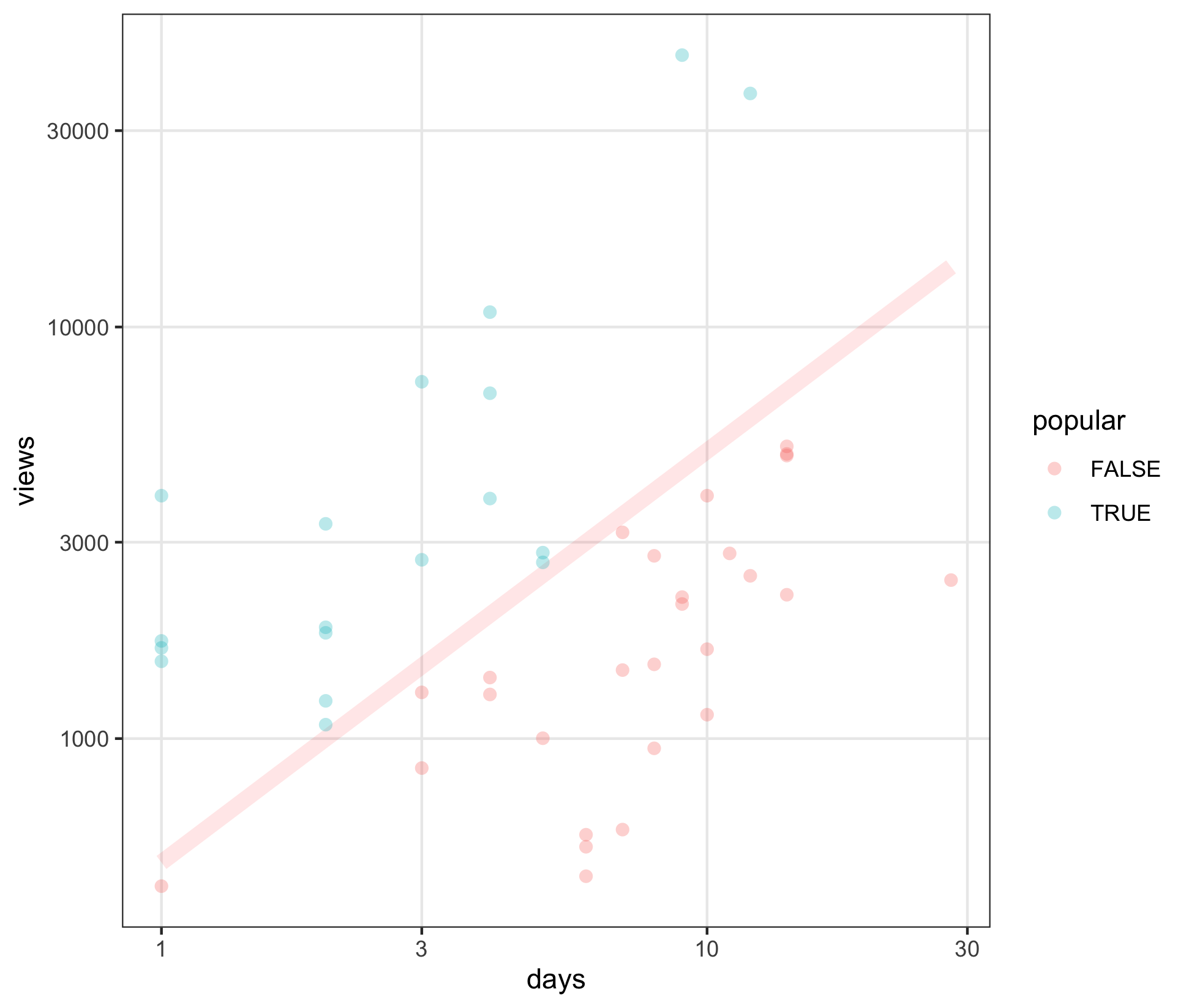
breakdown:
- same
viewsoverdays - careful: using log scales ⚠️
- log scales allow different magnitudes to be compared; to fit a smaller area
- they say all the benefits of log scales are cancelled out by having to explain log scales…
- pink line is
500 views per day - above the line is “popular” (teal)